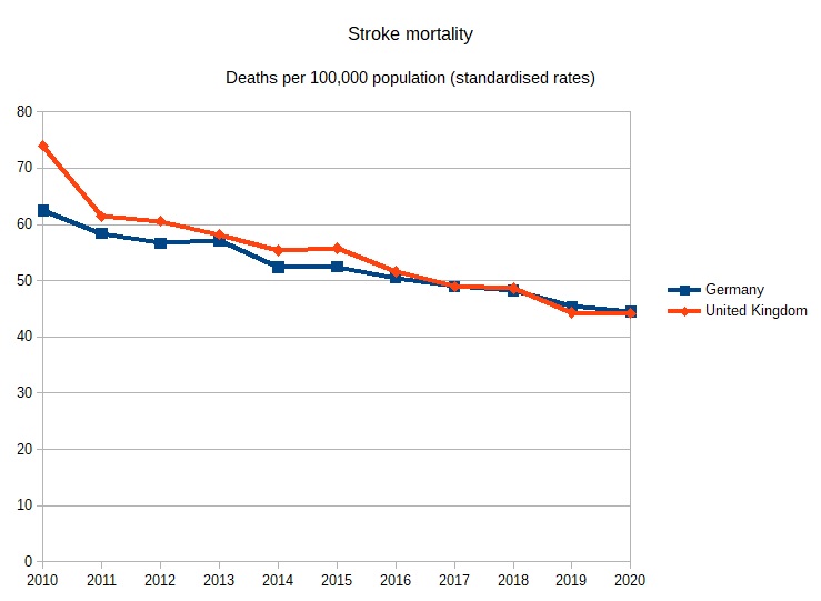
I recently came across this chart on stroke mortality. Source: OECD Health at a Glance 2023. It is quite stunning and seriously undermines the usual narrative on the NHS. The UK is listed 12th in the rich world (the OECD countries), one place above Germany.
Ten years ago the picture looked very different. Source: OECD Health at a Glance 2013. Back then the UK was listed 22nd, twelve places behind 10th ranked Germany.
The data from 2010 to 2020 is available from the OECD Health Statistics database. I charted the UK and German data below. It shows the UK reducing its stroke mortality by 40% in the decade 2010 to 2020 and just pipping Germany by 2020.
It is very clear that stroke treatment in the UK improved massively in the previous decade and that the UK climbed the international rankings. I am sure someone will push back at me and say it was just the continuation of initiatives started under the previous government. There is some truth in that. It is also true that the NHS kept on improving and overhauled Germany in spite of austerity, etc.
The centralisation of stroke services into higher quality specialist centres was often bitterly contested by many silly politicians, not least MPs and councillors where I live in Ealing, but the NHS ran this change through with stunning results. And was encouraged to continue to do so by successive governments after 2010.
This week there has been a certain amount of hopping around about child poverty. UNICEF, the UN body for children, came out with a report that placed the UK at the bottom of a table of 43 wealthy countries, showing the biggest rise in child poverty – 20%. It is misleading. Or at least it is in terms of the UK debate.
Devastating @UNICEF league table on changes in child poverty over 7+ years up to 2021: UK in the bottom spot
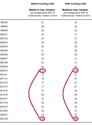
For the whole length of time that the Conservatives have been in power there have been predictions of growing child poverty. These never come true, or at least not at any scale. The reason they never quite come true is that the favourite measure of child poverty is the largest. That metric is percentage of children living in households with less than 60% of median income after housing costs. Relative CP AFC for short. Part of the DWP’s Households Below Average Income dataset. The percentages can be found at Table 1.4a.
Relative child poverty (after housing costs) has wandered around 30% for the whole of this century so far. This is a big number, but most of its change can be attributed to movements in the overall economy. So, after the global financial crisis child poverty fell, strangely, in the face of austerity. Why? Because government workers fell in number (and they are often highly paid) and private wages fell, but benefits kept their real terms value, hence relative child poverty fell. Or at least the median household income moved down relatively making fewer children “poor”. Since then as public sector employment has risen with Covid and wages have started to rise, child poverty has risen again slightly. Notably though, it has only got back to where it was when New Labour left power.
The UNICEF report does look bad as it shows the UK increasing child poverty by 20%. This is a source of dismay. There are two caveats though. Firstly, the measure they used was the before housing costs one. No-one uses this in the UK. If I was being cynical it is because this number is typically 20% so it doesn’t sound quite so harrowing when you say 1/5th of children in poverty rather than 1/3rd. But mainly it isn’t used because we all live after housing cost lives. The after housing costs measure only rose by 6.8% in the seven year window UNICEF used. This is a much smaller rise and very similar to other very wealthy countries like ourselves.
It is dishonest and misleading to consistently cite 30% child poverty then switch metric to steal the rise in another metric that you never use because it is always smaller.
The other caveat is that this metric fell by 20% in the previous 7 year period so it has merely returned to its starting point. As is so often the case, we are served bad news but not the good. When did you hear about the 20% fall in child poverty “under the Tories”?
At the end of the New Labour period relative CP BHC was 19.98% in 2009/10. The latest figure available for 2021/22 is 20.01%.
At the end of the New Labour period relative CP AHC was 29.38% in 2009/10. The latest figure available for 2021/22 is 29.17%.
So, after 12 years of Conservative government the BHC measure is a tiny fraction worse (higher), 0.03 percentage points. The AHC measure is a bit better (lower), 0.21 percentage points.
For the 13 years of New Labour these measures were worse on average than the years since. There was only one New Labour year when the BFC measure was better than the last available data point. There were only 2 years when the AFC measure was better than the last available data point. Even if you take out Labour’s first 5 years on the basis that they were a hangover from the previous government New Labour still underperforms. In spite of dealing with austerity and Covid the Conservatives have a better record on child poverty than New Labour.
Yesterday, 3rd August, Rachel Reeves, Labour’s Shadow Chancellor was keen to jump on this BBC chart updated 3rd August.
Only it is wrong.
The Federal funds target range went up following the Fed announcement of 26th July to 5.25-5.50%. The effective Federal Funds rate went up from 5.08%, as seen on BBC chart, to 5.33%. It seems the BBC chart left off the latest rise in US rates. The US data published by Fed New York:
So the BBC got this wrong and Reeves repeated without checking. I have written to the BBC’s Kevin Peachey but he has not responded.
Of course, Reeves’ biggest fail is ignoring the trend that is affecting all economies and trying to find a gotcha. Rankings are the Devil’s work. Always check where your peers are. Yes, English speaking world 1% ahead of EU. Same staircase.
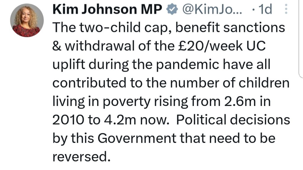
On Wednesday the Labour MP for Liverpool Riverside asked Prime Minister Rishi Sunak a question about child poverty. Of course her question was an opportunity to make a political point. She claimed that “… your government’s austerity measures have plunged 4.2 million children into poverty …”.
Our Vice-chair @KimJohnsonMP today asked the Prime Minister to commit to scrapping the ineffective and cruel two child limit policy which has plunged 4.2 million children into poverty. pic.twitter.com/1rBQDn38xp
— Child of the North (@ChildoftheNort1) June 14, 2023
In response the PM said: “… there are in fact 400,000 fewer children in absolute poverty than in 2010”.
You can watch the exchange here at 17:05 minutes in.
This exchange was brought to my attention by Ava-Santina, PoliticsJoe journalist and ex-producer of James O’Brien’s LBC talk radio show. She questioned the veracity of Sunak’s rebuttal.
Not sure where Rishi Sunak got his "400,000 fewer children in poverty since 2010" line just dished out at PMQs
But according to Joseph Rowntree Foundation, that number has gone from 2.6 million in 2009/10 to 4.1 million children in 2021/2
Sunak is quoting DWP HBAI children in absolute low income households after housing costs. This has gone down by 400K. From 3.7m in 2009/10 to 3.3m in 2021/2.
These are the gold standard stats for poverty in the UK and for child poverty. There are 4 series – relative and absolute child poverty before and after housing costs. He was clear he was quoting absolute numbers although it is a somewhat synthetic measure. He did not explicitly say after housing costs but not many people actually lead a before housing costs lifestyle so most commentators pretty much always use after housing costs unless they are playing games – which we will come back to.
So Santina is impugning Sunak who was making a reasonable rebuttal using statistics that he identified pretty transparently. Santina seems to want to let Kim Johnson get away with blue murder though. Relative child poverty after housing costs rose from 3.9 million at the end of 2009/10 to 4.2 million a the end of 2021/22 (the latest figures available). So a rise of 300,000. Johnson is attempting to blame Sunak for the whole 4.2 million, not just the 300,000 rise in the 12 years in question. Also Johnson fails to give any clue as to where her numbers come from and fails to mention they are relative child poverty numbers. Johnson gets away with a whopper.
There is more to this story though than Santina throwing shade at Sunak and giving Johnson a pass. Both Santina and Johnson tell very large lies themselves. The second sentence of Santina’s tweet said:
But according to Joseph Rowntree Foundation, that number has gone from 2.6 million in 2009/10 to 4.1 million children in 2021/2
Also Johnson tweeted:
I think Santina’s 4.1 million number is just a typo. It should be 4.2 million. It is the number of children in relative poverty after housing costs in 2021/22. What is the 2.6 million number? It is the number of children in relative poverty BEFORE housing costs in 2009/10. Coincidentally both of these number rose 300,000 in the period. By swapping from one measure to the other both Johnson and Santina are telling a lie. Santina attributes this to the Joseph Rowntree Foundation but I suspect that is not the source of Santina’s “confusion”.
The graphic below illustrates what Johnson and Santina have done.
Sunak was pretty transparent, he said “absolute”, he quoted the latest official statistics.
Johnson and Santina are lying by mixing data from two different data series. No-one would do this unless they were actively trying to deceive. These are grown-ups, an MP with staff and an experienced political journalist. There is no excuse for just peddling nonsense. I have asked them to delete all three tweets.
This week’s Panorama used a piece of work from the Resolution Foundation as a basis for a discussion on the UK economy.
We've made a @BBCPanorama looking at how UK wage growth has stalled & at how this connects to the UK's levels of productivity and investment. Wages are our starting point & this explainer looks at what's happened to them. Watch the full programme here: https://t.co/ktmkFFYwQGpic.twitter.com/4DjF1AonZk
This show led with a very misleading chart that shows UK real wages growth from the year 2000 and extrapolated the comparatively rosy 2000-2008 period to show the UK average worker was missing £11,000 in wages. A stunning takeaway.
Why is this chart is misleading? The first and perhaps most obvious reason is that the chart assumes a wonderful continuation of good times that simply isn’t available. It is a model. A fantasy. It is an extrapolation for 15 years that assumes that the global crisis in 2007/2008 didn’t happen, assumes that Brexit didn’t happen, assumes that Covid didn’t happen and assumes that the Ukraine war didn’t happen. Of course these things did happen and a wonderful world where bad things don’t happen doesn’t exist.
Secondly, there are perfectly good comparators in the real world. There is no need to compare with a fantasy. An obvious comparator group for the UK is the G7 group of large, wealthy, industrialised democracies. How did they fare? The researchers for this programme could easily have gone to the World Bank, OECD or the IMF and found comparable wages data. Why didn’t they? I don’t know.
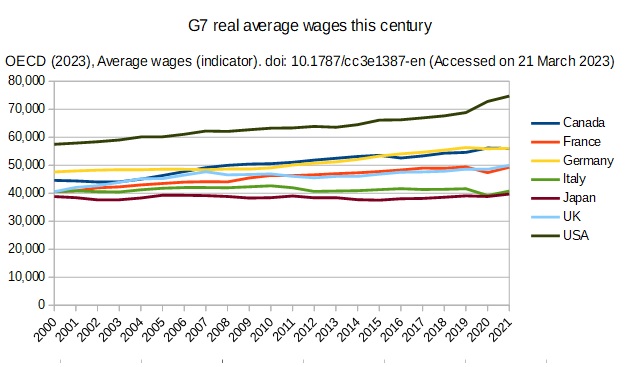
Anyway, I decided to do it for them. If you go to the OECD website and look at real wages from 2000 to 2021 most countries in the seven countries of the G7 had some real wage growth although Japan (at 2.3%) and Italy (0.5%) did very poorly. The UK (23.2%) beat France (21.5%) by a nose and Germany (17.5%) by a fair bit. Canada (25.6%) got out ahead of the Europeans and the USA (30%) was galloping ahead.
The chart below shows the time series for the G7 countries mapped out from 2000 to 2021:
The OECD is an organisation employing economists primarily that sets out to provide data that allows for the comparison of advanced economies. That is its raison d’etre. It’s methodology for this dataset is described below:
Average wages are obtained by dividing the national-accounts-based total wage bill by the average number of employees in the total economy, which is then multiplied by the ratio of the average usual weekly hours per full-time employee to the average usually weekly hours for all employees. This indicator is measured in USD constant prices using 2016 base year and Purchasing Power Parities (PPPs) for private consumption of the same year.
It is impolite perhaps to point out how poorly proud Italy, founding member of the European project in 1951, has performed inside the EU this century.
Somewhat disreputably when the Resolution Foundation/BBC wanted to make an international comparison it chose to swerve metric from UK wages to household incomes. Why? Because the actual wages data told the wrong story. The household income data is median rather mean which is probably why RF liked it. It is confounded by different, changing household sizes and different approaches to benefits/wealth distribution.
So, whilst UK real wages growth has been slow so have other countries at different times. Japan and Italy consistently this century. Germany only had 3% growth for the entire first decade of this century. It seems strange, childish even, to want your own good bits and other people’s too. If we want faster GDP growth and faster wages growth we should probably look harder at the US and Canada rather than Europe although I don’t think that the BBC/RF really want us to face that reality head on.
The type of counterfactual used by the Resolution Foundation has become very popular among commentators in recent years. And why not? It gives great headline. But, it is simply misleading to present an utterly unobtainable, fantasy counterfactual as a yardstick against which to measure actual performance. No amount of wishing can make the counterfactual happen. On the other hand, other countries’ real economies can offer us alternative models for how we might evolve our own economy. We would be much better off actively interrogating the successes and failures of our peers rather than crying over spilled milk. Both the BBC’s Panorama and the Resolution Foundation have done us a disservice with their flawed analysis.
On New Year’s day I had a conversation on Twitter with Sunday Times health correspondent Shaun Lintern. He made the point that the NHS was chronically short £40 billion a year on a European comparison over a 12 year period. [Note the report we will discuss actually looks at the 10 years preceding Covid.] It is an arresting number that he seemed quite wedded to given that it comes from the “respected” Health Foundation think tank. My interest was piqued so I decided to look.
I googled “£40 billion Health Foundation” and found their research and articles from the FT and inews.co.uk that picked it up. The Health Foundation’s research turned out to be simply a presentation of 10 years of comparable data from the OECD, the international body whose job it is to make such comparisons between advanced, industrial economies.
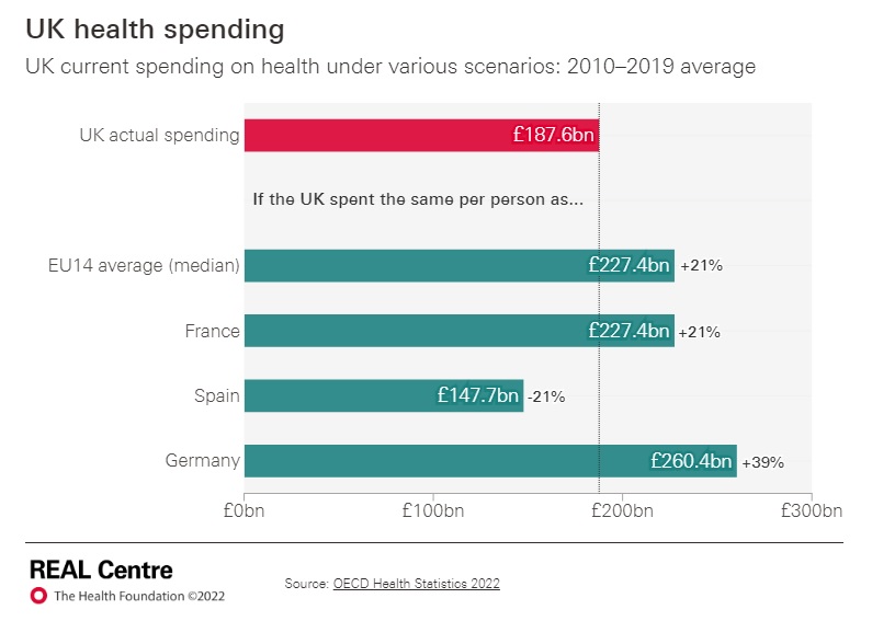
Now we come to the question of what is Europe? The Health foundation wanted to look at the old, established, rich EU-14. Otherwise known as the pre-Accession countries, of which the UK was one when we talked about the EU-15. So the Health Foundation wanted to talk about the richer half of the EU, not Europe.
The next decision the Health foundation made was to set as its benchmark for spending the median of the EU-14 not the mean. I am pretty sure what they have done is chuck out Luxembourg which only has a population of 640K and then choose the middle ranking country in terms of health spending per head which turns out to be France. It has spent 21% more on health (private as well as public) than the UK in the decade 2010-2019. As you can see the Health Foundation calculates the European mean and the French figure to be exactly the same to four significant places, ie 1 in 10,000. Europe is France apparently. It is perfectly respectable to want to copy France but France is not Europe.
It is worth noting that France is quite unusual in European terms. Although its GDP per head matches the UK’s and has done consistently for many years it has very large health spending in terms of percentage of GDP, 1.5% a year of total GDP more than the UK. France was the second highest spender in the world after the US every year 2010-2016. It was pushed down into global 3rd place by Switzerland in 2017, it was 3rd to US and Germany in 2018 and 4th to US, Germany and Switzerland in 2019. France chooses to spend an outsize amount on health and has done for a very long time.
The chart below shows what the Health Foundation has done. By choosing the median rather the mean it has essentially removed the less well performing countries (Italy, Spain, Portugal and Greece) from the average. If you compare the UK with their median (France) the UK is 21% or £40bn a year short of France. If you compare with the mean this goes down to 8% or £15bn a year.
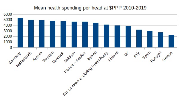
The UK has a large population at 67 million. It might make sense to compare it to other large countries in the EU-14, ie Germany, France, Italy and Spain. In this case the difference goes down to 5.8% or £11bn a year. It you take out the countries under 10 million (ie Denmark, Austria, Finland and Ireland), that might not be able to achieve the economies of scale of larger countries, the deficit drops further to 3.4% or £6.5 billion a year.
If you observe that the three highest spenders in this analysis (Germany, Netherlands and Austria) have very expensive and unrestrained health insurance models, and you take them out, then the difference disappears entirely. Yes, we spend less on average than countries that have a very expensive insurance model that very few people in this country want.
Frankly, I think the Health Foundation has been misleading. In the main body of their original press release they mention the word “average” 5 times in relation to the EU-14 and only mention the word “median” once at the bottom in a note to editors. They should have said up front they were making a comparison with France.
Lintern’s argument that “we had [not] kept pace with Europe”, we could magically have “£40 billion a year extra”, hence “managed decline” and the “NHS has been run down” rests on a statistical sleight of hand. Essentially Lintern and the Health Foundation wants us magically to have found an extra 1.5% of GDP every year for ten years to be like France. When you consider that UK’s payments to the EU were less than 1% GDP, we struggled to get to 0.7% GDP for overseas aid and the defence budget hovers around 2% you can see that 1.5% is not a small amount of money. Yes, we could choose to be like France with a relatively low GDP per head but outsize health spending all the same but some enormous changes to our tax and spending decisions would be required. This is a respectable argument to make but it is an argument that we should be unusual like France.
First off international bodies such as Eurostat and OECD don’t usually publish these charts with the WORST at the BOTTOM. It isn’t very good for international relations! They print them vertically. Why has the BBC chosen to make this international comparison like this and is the UK really at the bottom for doctors?
The simple answer is: no, it isn’t. The whole data set as originally presented by the OECD shows the UK in the bottom half of the chart but not at the bottom and with some important countries doing worse than us.
But, first let’s consider the countries above us on the BBC chart. Fully half, 6 out of 12, are tiny with populations under 10 million. The UK population is over 67 million. Another 2 are less than 20 million. Only 4 are large, rich democracies like the UK.
Small countries like Austria that avoid defence expenditure can afford to spend more on health. Tiny Ireland is another defence free rider. Tiny, oil rich Norway is similarly blessed. Belgium only just manages to get its nose ahead. If we are counting small countries where is tiny, but very rich, Luxembourg? Slightly below us at 3.0. Why did Luxembourg drop off the chart?
On the original, vertical, OECD chart of the data that the BBC references I have highlighted the 10 large (over 20 million population), rich countries in the OECD. Suddenly the UK (in purple) is not in the BBC’s worst, bottom of the chart place. In fact three fellow G7 members, Japan, USA and Canada, are to our left. Why doesn’t the world’s largest economy have more doctors? What about the 3rd?
So looking at large, rich democracies like us who have to pay for their defence and want to have a say in global affairs we are mid-table for doctoring. We have five states to our left, France slightly ahead and three out performers who, coincidentally, are all comparatively light on defending themselves.
You might think that an ex-prime minister, with a track record for concern for social issues and eye to his reputation and legacy, would keep comments he made on an issue as important as child poverty strictly in the realms of the factually accurate. Child poverty is real for too many children and creating a distorted picture cannot help them. Unfortunately Gordon Brown is happy to spread complete untruths about this important subject.
Child poverty figures have risen from three million to four million and will rise beyond five million. Child poverty is set to become a national crisis. The government must act now. https://t.co/Cze2zXZFkz
Earlier this month Gordon Brown said: “Child poverty figures have risen from three million to four million and will rise beyond five million.” This is so mathematically nonsensical as to be a lie.
Brown and his staff know the main source of child poverty data in the UK is the DWP’s Households Below Average Income (HBAI) dataset which has the official status of a National Statistic. Within this dataset there are four main measures of child poverty – relative child poverty before and after housing costs and absolute child poverty before and after housing costs. The absolute numbers are not widely used or quoted and are slightly confected. Poverty before housing costs doesn’t mean that much as we all, on the whole, live our lives after housing costs. So the main number that everyone uses is relative child poverty after housing costs (AFC).
Relative poverty is a useful idea as we don’t really want to measure ourselves against historical standards but it is worth understanding what it is. It is people who live in households with less than 60% of median household income. Many people will be above this line, maybe paying a lot for child care and feeling really quite poor. Others will be below it, maybe with one income, a stay at home partner and a mortgage, but feeling their children do better that way. It is an entirely arbitrary measure and does not help us to identify and eliminate material burdens from children’s lives. That is another challenge altogether. The Labour party, the child poverty advocacy industry and the Left in general like this number because it is large and dramatic.
Which brings us back to Brown and his bent advocacy.
He says “Child poverty figures have risen from three million to four million and will rise beyond five million.” Below I have listed 13 years of New Labour child poverty numbers and 9 subsequent years of Conservative ones so you can judge for yourself. Note these numbers are slow to emerge and the 2019/20 data won’t come out until March next year so the latest numbers we have is for 2018/19.
The numbers haven’t dropped below the 3.6 million achieved in the first couple of years of the Coalition government. And they haven’t risen above the 4.3 million they hit in the early New Labour days. A mathematician rounding these numbers numbers down would say the number has been 4 million throughout. A mathematician averaging across the 13 years of New Labour would come up with an average number of 3.95 million. Across the 9 subsequent Conservative years the average is slightly lower at 3.88 million. Yes, the numbers do fluctuate typically falling in recessions and rising thereafter.
Note the rise in the child population. The relevant population rose 500,000 in the 13 New Labour years. And by 800,000 in the next 9 years. In fact the rise in population accounts for most of the rise is child poverty numbers from 2009/10 to 2018/19, 240,000 out of the 300,000 rise. Note also that the Labour party, the child poverty advocacy industry and the Left in general keep trying to steal the 2010/2011 datapoint as the end of New Labour to make the jump in the numbers seem larger, 600K, not 300K.
This point is underlined when you look at the percentages – which is a more sensible way of looking at relative numbers in any case. The most recent peak in relative child poverty AHC was in 2006-8 at 31%. It was 30% for two years at the end at the end of the New Labour era, it slumped as middle earnings were hit by the effects of the financial crash and returned to 30% for the last 4 years. You can complain that relative child poverty is fairly static if you want. You cannot argue that it is increasing (as Gordon Brown does misleadingly).
Brown’s assertion that child poverty “will rise beyond five million” is almost certainly nonsense. First of all it is a guess. There is no research or analysis to back up this assertion. Indeed the way the relative poverty numbers work relative poverty is likely to fall as it is almost always does in hard times. If middle incomes are depressed in a recession then lower incomes comprising a larger share of social security payments look more generous.