Categories
Fibbing with numbers and charts

Panorama and Resolution Foundation misleading on wages

This week’s Panorama used a piece of work from the Resolution Foundation as a basis for a discussion on the UK economy.

This show led with a very misleading chart that shows UK real wages growth from the year 2000 and extrapolated the comparatively rosy 2000-2008 period to show the UK average worker was missing £11,000 in wages. A stunning takeaway.

Why is this chart is misleading? The first and perhaps most obvious reason is that the chart assumes a wonderful continuation of good times that simply isn’t available. It is a model. A fantasy. It is an extrapolation for 15 years that assumes that the global crisis in 2007/2008 didn’t happen, assumes that Brexit didn’t happen, assumes that Covid didn’t happen and assumes that the Ukraine war didn’t happen. Of course these things did happen and a wonderful world where bad things don’t happen doesn’t exist.

Secondly, there are perfectly good comparators in the real world. There is no need to compare with a fantasy. An obvious comparator group for the UK is the G7 group of large, wealthy, industrialised democracies. How did they fare? The researchers for this programme could easily have gone to the World Bank, OECD or the IMF and found comparable wages data. Why didn’t they? I don’t know.

Anyway, I decided to do it for them. If you go to the OECD website and look at real wages from 2000 to 2021 most countries in the seven countries of the G7 had some real wage growth although Japan (at 2.3%) and Italy (0.5%) did very poorly. The UK (23.2%) beat France (21.5%) by a nose and Germany (17.5%) by a fair bit. Canada (25.6%) got out ahead of the Europeans and the USA (30%) was galloping ahead.

The chart below shows the time series for the G7 countries mapped out from 2000 to 2021:

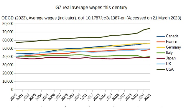
The OECD is an organisation employing economists primarily that sets out to provide data that allows for the comparison of advanced economies. That is its raison d’etre. It’s methodology for this dataset is described below:

Average wages are obtained by dividing the national-accounts-based total wage bill by the average number of employees in the total economy, which is then multiplied by the ratio of the average usual weekly hours per full-time employee to the average usually weekly hours for all employees. This indicator is measured in USD constant prices using 2016 base year and Purchasing Power Parities (PPPs) for private consumption of the same year.

It is impolite perhaps to point out how poorly proud Italy, founding member of the European project in 1951, has performed inside the EU this century.

Somewhat disreputably when the Resolution Foundation/BBC wanted to make an international comparison it chose to swerve metric from UK wages to household incomes. Why? Because the actual wages data told the wrong story. The household income data is median rather mean which is probably why RF liked it. It is confounded by different, changing household sizes and different approaches to benefits/wealth distribution.

So, whilst UK real wages growth has been slow so have other countries at different times. Japan and Italy consistently this century. Germany only had 3% growth for the entire first decade of this century. It seems strange, childish even, to want your own good bits and other people’s too. If we want faster GDP growth and faster wages growth we should probably look harder at the US and Canada rather than Europe although I don’t think that the BBC/RF really want us to face that reality head on.

The type of counterfactual used by the Resolution Foundation has become very popular among commentators in recent years. And why not? It gives great headline. But, it is simply misleading to present an utterly unobtainable, fantasy counterfactual as a yardstick against which to measure actual performance. No amount of wishing can make the counterfactual happen. On the other hand, other countries’ real economies can offer us alternative models for how we might evolve our own economy. We would be much better off actively interrogating the successes and failures of our peers rather than crying over spilled milk. Both the BBC’s Panorama and the Resolution Foundation have done us a disservice with their flawed analysis.

Categories
Fibbing with numbers and charts

All you need is 1.5% of our GDP to make everything better. Apparently

On New Year’s day I had a conversation on Twitter with Sunday Times health correspondent Shaun Lintern. He made the point that the NHS was chronically short £40 billion a year on a European comparison over a 12 year period. [Note the report we will discuss actually looks at the 10 years preceding Covid.] It is an arresting number that he seemed quite wedded to given that it comes from the “respected” Health Foundation think tank. My interest was piqued so I decided to look.

I googled “£40 billion Health Foundation” and found their research and articles from the FT and inews.co.uk that picked it up. The Health Foundation’s research turned out to be simply a presentation of 10 years of comparable data from the OECD, the international body whose job it is to make such comparisons between advanced, industrial economies.

Now we come to the question of what is Europe? The Health foundation wanted to look at the old, established, rich EU-14. Otherwise known as the pre-Accession countries, of which the UK was one when we talked about the EU-15. So the Health Foundation wanted to talk about the richer half of the EU, not Europe.

The next decision the Health foundation made was to set as its benchmark for spending the median of the EU-14 not the mean. I am pretty sure what they have done is chuck out Luxembourg which only has a population of 640K and then choose the middle ranking country in terms of health spending per head which turns out to be France. It has spent 21% more on health (private as well as public) than the UK in the decade 2010-2019. As you can see the Health Foundation calculates the European mean and the French figure to be exactly the same to four significant places, ie 1 in 10,000. Europe is France apparently. It is perfectly respectable to want to copy France but France is not Europe.

It is worth noting that France is quite unusual in European terms. Although its GDP per head matches the UK’s and has done consistently for many years it has very large health spending in terms of percentage of GDP, 1.5% a year of total GDP more than the UK. France was the second highest spender in the world after the US every year 2010-2016. It was pushed down into global 3rd place by Switzerland in 2017, it was 3rd to US and Germany in 2018 and 4th to US, Germany and Switzerland in 2019. France chooses to spend an outsize amount on health and has done for a very long time.

The chart below shows what the Health Foundation has done. By choosing the median rather the mean it has essentially removed the less well performing countries (Italy, Spain, Portugal and Greece) from the average. If you compare the UK with their median (France) the UK is 21% or £40bn a year short of France. If you compare with the mean this goes down to 8% or £15bn a year.

The UK has a large population at 67 million. It might make sense to compare it to other large countries in the EU-14, ie Germany, France, Italy and Spain. In this case the difference goes down to 5.8% or £11bn a year. It you take out the countries under 10 million (ie Denmark, Austria, Finland and Ireland), that might not be able to achieve the economies of scale of larger countries, the deficit drops further to 3.4% or £6.5 billion a year.

If you observe that the three highest spenders in this analysis (Germany, Netherlands and Austria) have very expensive and unrestrained health insurance models, and you take them out, then the difference disappears entirely. Yes, we spend less on average than countries that have a very expensive insurance model that very few people in this country want.

Frankly, I think the Health Foundation has been misleading. In the main body of their original press release they mention the word “average” 5 times in relation to the EU-14 and only mention the word “median” once at the bottom in a note to editors. They should have said up front they were making a comparison with France.

Lintern’s argument that “we had [not] kept pace with Europe”, we could magically have “£40 billion a year extra”, hence “managed decline” and the “NHS has been run down” rests on a statistical sleight of hand. Essentially Lintern and the Health Foundation wants us magically to have found an extra 1.5% of GDP every year for ten years to be like France. When you consider that UK’s payments to the EU were less than 1% GDP, we struggled to get to 0.7% GDP for overseas aid and the defence budget hovers around 2% you can see that 1.5% is not a small amount of money. Yes, we could choose to be like France with a relatively low GDP per head but outsize health spending all the same but some enormous changes to our tax and spending decisions would be required. This is a respectable argument to make but it is an argument that we should be unusual like France.

Categories
Fibbing with numbers and charts

One of the BBC’s “UK is worst” charts

I was disappointed to see this chart on the BBC News website on Saturday under Nick Triggle’s byline. In an otherwise balanced piece that introduced some challenging points this chart stood out as being misleading.

First off international bodies such as Eurostat and OECD don’t usually publish these charts with the WORST at the BOTTOM. It isn’t very good for international relations! They print them vertically. Why has the BBC chosen to make this international comparison like this and is the UK really at the bottom for doctors?

The simple answer is: no, it isn’t. The whole data set as originally presented by the OECD shows the UK in the bottom half of the chart but not at the bottom and with some important countries doing worse than us.

But, first let’s consider the countries above us on the BBC chart. Fully half, 6 out of 12, are tiny with populations under 10 million. The UK population is over 67 million. Another 2 are less than 20 million. Only 4 are large, rich democracies like the UK.

Small countries like Austria that avoid defence expenditure can afford to spend more on health. Tiny Ireland is another defence free rider. Tiny, oil rich Norway is similarly blessed. Belgium only just manages to get its nose ahead. If we are counting small countries where is tiny, but very rich, Luxembourg? Slightly below us at 3.0. Why did Luxembourg drop off the chart?

On the original, vertical, OECD chart of the data that the BBC references I have highlighted the 10 large (over 20 million population), rich countries in the OECD. Suddenly the UK (in purple) is not in the BBC’s worst, bottom of the chart place. In fact three fellow G7 members, Japan, USA and Canada, are to our left. Why doesn’t the world’s largest economy have more doctors? What about the 3rd?

So looking at large, rich democracies like us who have to pay for their defence and want to have a say in global affairs we are mid-table for doctoring. We have five states to our left, France slightly ahead and three out performers who, coincidentally, are all comparatively light on defending themselves.